Classic Book Cover Design

Frankenstein by Mary Wollstonecraft Shelley

Mary Shelley’s Frankenstein is one of my favorite books to read and design. I had a lot of fun coming up with these AI-generated Frankenstein illustrations. I used a variety of prompts for the images, including “sci-fi,” “electricity” and “Boris Karloff style.”

I tried a variety of different fonts for the covers, from Victorian style to Futuristic. I let the AI determine the colors in the illustrations, mostly because I hadn’t yet figured out that I could specify which colors to use.

I changed the basic layout for these three covers. I didn’t want the text to cover up the images, so I began by placing the title at the top of the cover and author name at the bottom. I think the designs with the black background and colored text are easier to read, but I also like the cover with the text placed over the image.

Classic Book Cover Design: Abstract Artwork

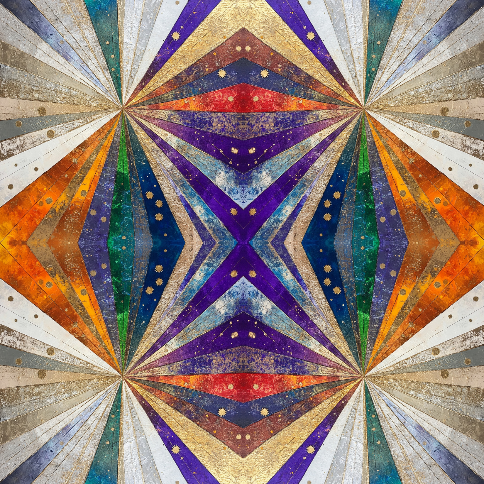
The AI can generate endless types of abstract images and patterns. When I first started my classic book cover design project, I was looking for artwork that showed a person or place from the book.

These are some of the abstract images and layouts that I came up with to hopefully reflect some aspect of the books. I also varied the fonts to reflect the topic or time period of each book.

Anna Karenina, Leo Tolstoy

I used a variety of prompt to generate the images, including “Victorian,” “Floral,” “Futuristic,” “Victorian,” and “Art Deco.” At first, I let the AI pick the colors for the images, but then I started specifying which colors to use.

1984, George Orwell

I was trying to generate futuristic looking images for these Brave New World covers.

Brave New World, Aldous Huxley

The AI came up with these images for The Great Gatsby with prompts like “Art Deco” and “floral pattern.”

The Great Gatsby, F. Scott Fitzgerald

I got a lot of Instagram likes with the first of these two Hamlet covers.

Hamlet, William Shakespeare

Henrik Ibsen’s Hedda Gabler is one of my favorite books. I was looking for images that were feminine yet somewhat on the dark side.

Hedda Gabler, Henrik Ibsen

Classic Book Cover Design: Bram Stoker’s Dracula

The AI image generator came up with endless varities of Dracula images based on the many prompts that I entered.

I started out looking for “Victorian” Draculas, moved on to “Edwardian,” and then tried many differents styles of artwork, including “Sci-Fi,” “Futuristic,” and “Impressionist.”.

I broke out of setting the title in a colored bar at the top and the name at the bottom format for many of these Dracula covers. I also experimented with different fonts and colors and placing text over the artwork.

 I hope you enjoyed these Dracula covers as much as I did in creating them. I’m sure I’ll be doing a lot more in the future.
Designing and Typesetting Classic Books

I was looking for a way to practice my book design and typesetting skills, and had the idea to start designing the first pages of classic books. I found the text of the books on the Project Gutenberg website (https://www.gutenberg.org).

I started with the text of Bram Stoker’s “Dracula,” experimenting with different fonts, colors, and layouts; and then moved on to dozens of other books, including “The Tragedy of Hamlet, Prince of Denmark,” “Gulliver’s Travels, “The Great Gatsby,” “Frankenstein,” and many more.

For me, the process of design is about moving from one concept to another through small variations on a theme, leading to completely new ideas. I particularly enjoyed working on these designs because they were made to be viewed onscreen. In reality, most books end up printing in black and white due to the high cost of color printing.

These are two layouts for the first pages of Dracula. I started the text at different points in these samples before I decided to focus on the first pages of books.

These two layouts of the first page of William Shakespeare’s “The Tragedy of Hamlet” are similar in many ways, but I used different fonts, colors, and printer ornaments. I made dozens of variations of this book designs, and these are two of my favorite ones. I started adding the author names below the chapter titles in later designs, but I like how these look without the name.

These two designs for “The Great Gatsby” share the boxed border and gold background, but are otherwise quite different. If you’re noticing that the left-hand margin is a little wider than the right-hand margin in these samples, it’s because the inner margins of all printed books are always wider than the outside margins to leave space for the interior book binding. These pages are set up for print—I would even out the margins if the book was meant to be viewed onscreen.

These two designs of Charles Dickens’ “Great Expectations” and Jonathan Swift’s “Gulliver’s Travels” use some of the same design elements, but show how color can change the tone of the design. There are an endless number of printer ornaments to choose from. I usually pick three different types of ornaments to show as samples of the range of options available. Sometimes it takes a few rounds back and forth to arrive at the right ornament for a book.

These two designs for Robert Louis Stevenson’s “The Strange Case of Dr. Jekyll and Mr. Hyde” were some of my earlier designs and also lack the author name. The type size of the main text is smaller than in later samples, where I was trying to make the text larger to be more readable onscreen. The type size is approximately 12 point type with 16 points leading, which is about right for printing. Some types of books (academic or scientific, for example) use type set as small as 10/12 for the main text, I typically use a type size ranging from 11 to 12 for most books, with leading anywhere from 14-18 points, depending on the length of the book and the desired page count.

If I were designing a book for onscreen use only, I would use a larger type size and leading: something like 14 to 16 point type with 20 to 24 points of leading would be readable when viewed at full size.

These are two of my earlier designs for “Frankenstein; Or, The Modern Prometheus” by Mary Wollstonecraft Shelley. My original idea was to add the book title to the first page of the book as in these samples, but then I decided to add the author name as well.

These are two of my later “Frankenstein” designs, where I started using different backgrounds behind the text. There’s still no author name in the layout, probably because I picked up the text from the old files and forgot to add it. There’s room to add the author name above or below the book title without having to reduce the type size by much.

My main goal as a book designer and typesetter is to improve and enhance the readability of the text. I’m not to trying to draw the reader’s attention to my design as much as I’m trying to get them to read the book. A reader should be able to easily understand the hierarchy of titles and subheads in a book design, and all tables, figures, and text boxes need to be placed in the best spot as close as possible to where they’re called out in the text.

One of my first book typesetting jobs was working as a freelance typesetter for Addison-Wesley in the early 1990s. I was working on the typesetting of a series of assessment tests for grade school students. The design was fairly simple but most of the pages had 2-point vertical black lines running from the top to the bottom of the outer edges of the pages. I realized that the lines were there to stop the student’s eyes from wandering off the page–a gentle reminder to focus on the text.

I learned that everything on the page should be there for a good reason, usually beyond just decorating the page. That still leaves an infinite variety of options for designing a book—I try to choose wisely.

If you’re interested in seeing more of my book designs, I’ve been posting interior and cover designs of classic books to Instagram: https://www.instagram.com/andreareiderdesign/

Using AI-Generated Artwork for Classic Book Covers

My entire career as a book designer and typesetter for print and e-books has been about embracing, learning, and using new technology. So I was pretty open to seeing what I could do with the new AI image-generating programs.

I started using the Microsoft Bing AI Image Generator in early 2023, which was then powered by the DALL-E 2 version of the program. The Bing Image Generator was recently updated to the DALL-E 3 version, which generates significantly different results than the older version.

I started designing the first pages of classic books mostly to practice and update my design skills and to see what I could produce. I had been working mostly on book designs for the first pages of classic books for several months when I decided to try using an AI Image Generator to create cover illustrations to use in the design of book covers of the classic books.

One of the first covers I worked on was for Leo Tolstoy’s “Anna Karenina.” Below are two examples, one of Anna herself, and the other a floral pattern where I specified the colors and style of the abstract image.

Bram Stoker’s “Dracula” is one of my favorite books to read and it’s also a great book to work on as a designer and typesetter. I spent weeks generating different types of Dracula illustrations in every style that I could think of to try. I used various prompts to generate the images, including Dracula, moon, bats, fire, wolves, and many different styles, including Victorian, Art Deco, Sci-Fi, and Gothic.

My Dracula book covers were getting enough likes on Instagram for me to keep going. But my interior and cover designs of “The Fountainhead” and “Atlas Shrugged” by Ayn Rand usually get the most 

My Dracula book covers were getting enough likes on Instagram for me to keep going. But my interior and cover designs of “The Fountainhead” and “Atlas Shrugged” by Ayn Rand usually get the most likes of anything that I post, which I think attests to the number of Ayn Rand fans and followers out there.

I started out using “1984” for the George Orwell book cover title, but then realized that the correct title was “Nineteen Eighty-Four.” I can see where other publishers and designers decided to shorten the title to “1984” as it looks great in type and stands out as a book title.

The Bing AI Image Generator that I used for these images shows four images to choose from for each prompt. I was mostly looking for literal representations of the book topics, such as the main characters or recognizable settings—but the AI was great at generating great abstract images and patterns. I loved some of the images, but couldn’t figure out any book that they would be right for. So I decided to do some self promotion. These are two of my favorites.

I enjoyed working on these covers of Aldous Huxley’s “Brave New World.” I used various types of prompts to come up with the images, including “sci-fi style” and “futuristic.” The program had thoughts of its own just based on the words “brave new world.” I used my best sci-fi style type faces for the titles and author names.

I’ve had very good and interesting results in using AI to generate images for many characters from classic books. When entering a prompt for an image, you can be as specific or as general as you want to be. Sometimes I like to specify things like colors and art style, but it can be useful to see what the program comes up with on its own. I went through many variations before I settled on these images for Dorian Gray, Dr. Jekyll and Mr. Hyde, and Frankenstein.

Series design for Dante Alighieri’s Divine Comedy: “Inferno,” “Purgatorio,” and “Paradiso.” I can’t take credit for the rendering of the illustrations, but I think they work together as a set. If I were to do again, I would make the backgrounds a darker shade of gold, or maybe try a black or red background with white or gold type.

I have a lot of ideas for new book covers, and plan to experiment more with a variety of different types of layouts. I used a similar design for most of these covers, with the book title at the top of the page and the author name centered at the bottom. I didn’t want to cover the images with text, but it will be a great challenge to figure out creative ways to set the type over the images.

I was mostly focusing on using different type faces for each book that would convey something about the time period, tone, or topic. I also changed the color and textures of the bars at the top and bottom of most pages so that they would coordinate with the colors in the image.

I haven’t used any AI images for actual books yet, but I expect that to happen in the near future.